| Packaging Design can quickly communicate what your product is about. With thousands of similar products vying for attention, it's easy for customers to feel overwhelmed. The solution? Personalized packaging! Your packaging should speak to your unique audience - those who care about your message and your product . |
Packaging Design
Weston Smoothie Cafe


-
Weston Smoothies is an all natural juice, made with a blend of fruits and vegetables. Created in house and perfected with the right amount of sweetness leaving you wanting more!
Weston Smoothie’s brand is colourful by nature, with a bright magenta for a logo and a repeating fruit background, the brand take inspiration from the colour of their own bubble teas and smoothies.
A key element to keep consistent was vibrancy, and fun.
However, wanting to go in a slightly new direction for their drinks, meant we look towards what new element can convey the sweet and playful smoothies, in pre bought organic drinks.
The main question was: Why would i buy or look for a pre packaged drink in a store that sell them fresh and to order?
-
How do we keep the new design consistent with their brand identity?
Weston Smooth is playful and that becomes obvious with the irregular shape of their logo and fun but bold font choice. What this meant what keep it irregular, fun, but clean.
So, in keeping with their existing brand we kept the irregular shape of the logo in our labels. Not only does this create a playful look but it does so without it straying too far from the original logo design. We also decided to keep the fruit illustrations in the background but made sure they aligned with the particular juice so each one had a particular pattern, and colour.
2. What does a pre packaged bottle provide that a in store smoothies does not?
The second problem was about attention! people were not noticing the juices and as a result they weren’t selling. Our goal was to emphasis that these juices were just as unique in flavour as any of the bubble teas in store. For this we added the images of the ingredients while making sure to emphasize the names which were meant to signal to their individual benefits.
THE BENEFITS! These juices are organic, and simple. Simple ingredients means less time thinking about whether you should or shouldn’t get something. This was the target. Get people interested through the fun look and help them make quicker decision by simplyifying the information and making the benefits clear.
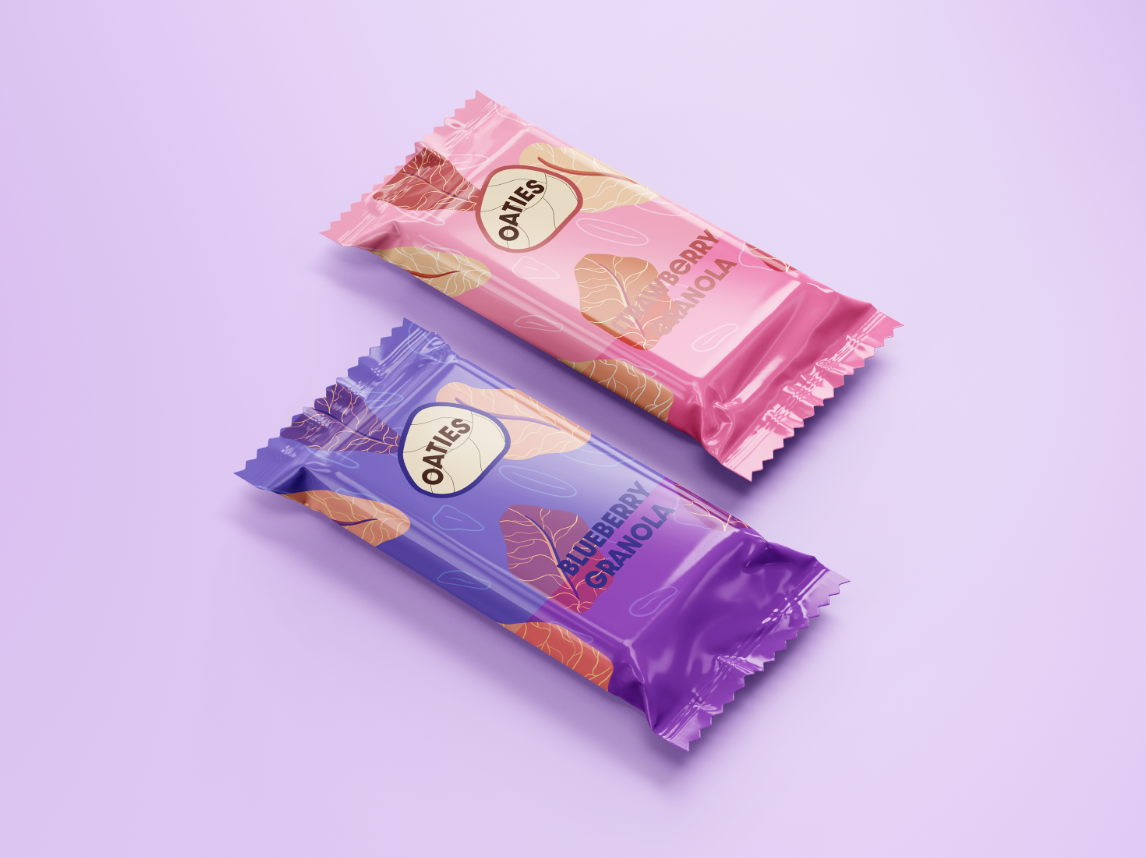
Oaties


-
The Oaties granola bars aim to energize during your three o’clock crash. Small sized for easy travel, Oaties come in different flavours: from chocolate, and raspberry to blueberry and banana. With the added joy of different dried fruits and roasted nuts, Oaties aims to give you back energy and fuel the rest of your day.
The key words for this brand was ‘fun’ but ‘minimal’. Aimed for a wide audience our main objective was to create a design that was eye catching for both an older and younger buyer. An important feature of this brand is for the flavours to be easily identifiable through colours, helping you find them in any bag, but easily readable through a flat and minimal look.
-
How do we translate the taste and flavours while keeping it minimal? How do we keep it interesting?
Colour is our favourite go to. But this time, it was choosing the right shade to make sure the flavours are as close to the real thing, and then some. The point was that it looked like you had already opened it, right there in you hand! We then added glossy paper to make them pop and eye catching to seal the deal.
To keep it minimal we kept the pattern in the back simple and the same across flavours emphasizing the granola in all the bars.
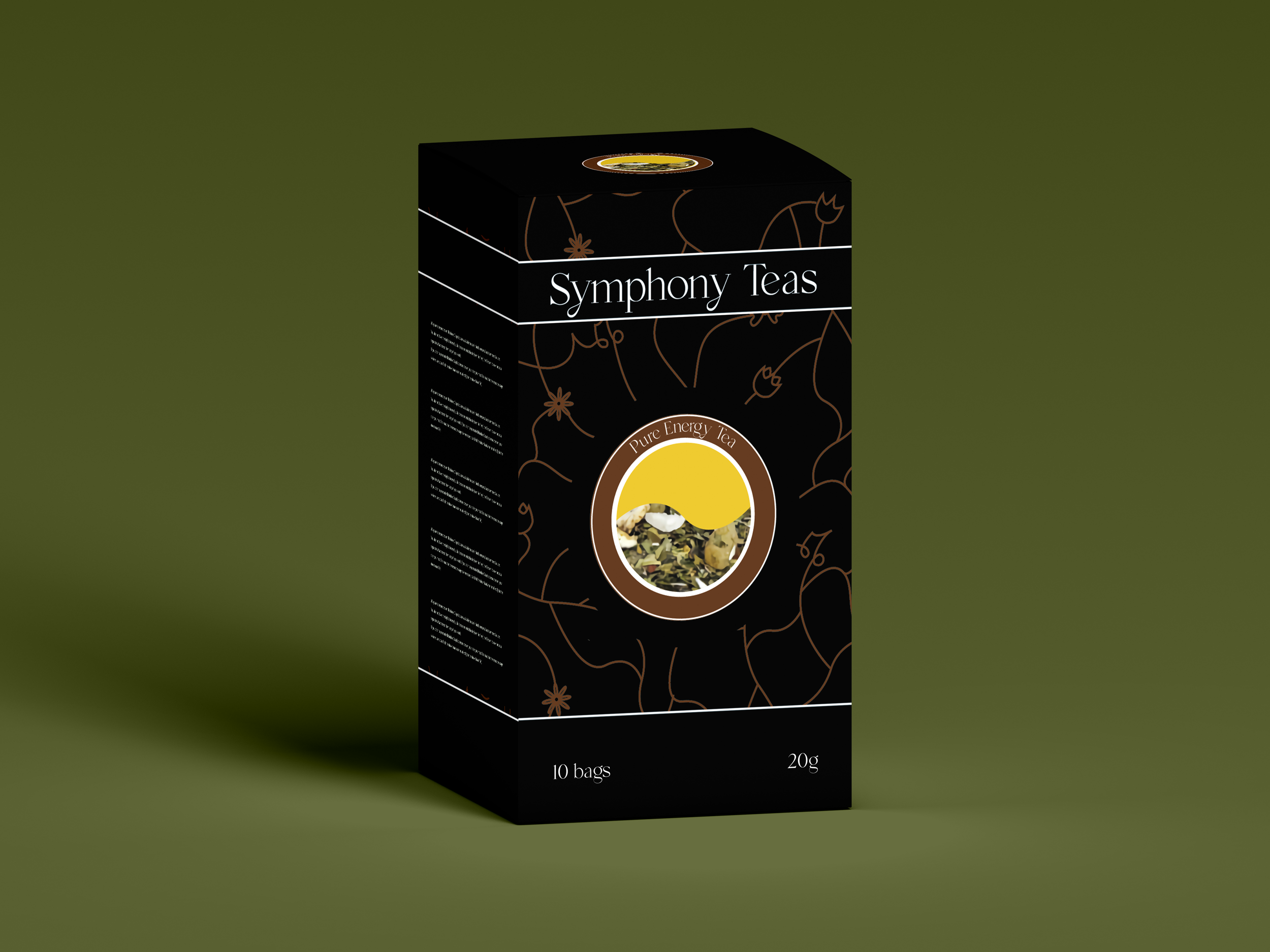
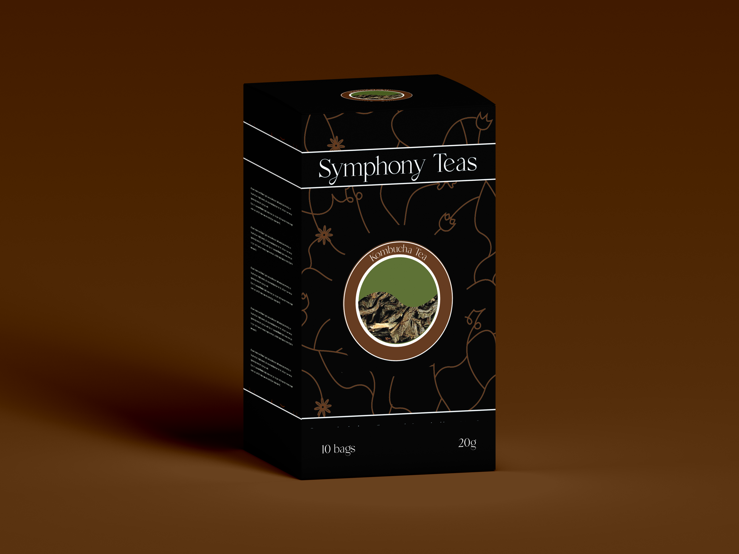
Symphony Teas


-
Symphony Teas, is an all natural brand of teas that actually taste good! With hand picked ingredients meant to help you get more energy, or relax and wind down, symphony teas can be enjoyed by anyone. From Tea connoisseurs to tea hobbyists, symphony teas’ perfect blends bring a sense of balance to the busyness of everyday. The tea label is placed both on the front and top for different display options, as well as easy legibility, while keeping the side minimal for easy ingredient reading. The front takes inspiration from plant roots, with a brown flower pattern that is elegant, and understated to bring out the logo in the middle.
-
Symphony Teas main problem was Identity. Many teas are organic, many are relaxing. So what stood out with Symphony Teas?
They were made with a team who loves teas. They spent alot of time researching and testing different notes and flavours all while making sure they were high quality. Their goal to create a sense of harmony and tranquility without sugars and additives. This means this tea was made by a tea lover for tea lovers in particular. People who dig deep into the world of tea making and notice subtly in flavour profiles.
The goal here was to provide a design that was refined an emphasized this sense of exploration to find harmony. For this we kept it simple with a background inspired by roots, and a illustration that highlighted the ingredients while emphasizing the key word for us : harmony.
Easy Oats

-
Easy Oats are quick oats sold as a part of a larger brand called Easy Well. These quick oats come in large pouches for families, or individual looking to buy in bulk. Used for morning oatmeal or baking, such as cookies or granola bars, the oats are multipurpose for different cooking needs.
The main objective is to give an example of its’ most common use, as well as allow the packaging to help market the oats easily at a distance. The blue was meant to differentiate it from brown, beige, and dark blue palette common in oatmeal packaging.
-
Ocean Tea


-
Ocean Tea, is a tea line surrounding the theme of serenity and peace found in the depth of the ocean. These tea are meant to ease one into sleep with calm notes of camomile, green tea, lavender, as well as other natural ingredients. These teas are perfect for those who have trouble sleeping, or just need to wind down for the evening. This loose tea, uses illustrations of sea animals to help illustrate the idea of tranquility and peace. Animals such as turtles and whales add to the slow calm feeling that the tea aids in achieving. The colours used are jewel toned to stand out among more earth toned tea label. However, gradients were used to dissolve any harshness, as well as to mimic diffusion of the tea within water.
-
Description text goes here